- Posted using BlogPress from my iPhone
Monday, November 22, 2010
Oh, how I love cone trees...
- Posted using BlogPress from my iPhone
Saturday, November 20, 2010
Friday, July 9, 2010
New floors
Thursday, July 1, 2010
When I say navy I mean navy
Tuesday, June 22, 2010
Inspired by Navy
Well now I have to paint the room navy.
Just kidding. I wouldn't do it just because I saw this but I do love the way the navy looks with the white trim and dark wood. I'll post some pictures when I'm done.... and when I convince my husband that navy is the right choice.
Monday, June 21, 2010
Waiting on this...
Thursday, June 3, 2010
My New Favorite Letter
I made this for a little girls room. Can you tell? Lots of flowers and lots of glitter. Love it. I hope she likes it!
Tuesday, May 11, 2010
Flower fail
I have had this vase forever and never used it for flowers.
Well I came in about an hour later and noticed a big puddle of water on the floor.
Did the toilet overflow?
No, apparently the vase isn't great at holding water. Maybe it's not a vase at all, I don't know.
I did what any normal person would do. I stuck a washcloth under the vase and called it fixed.
Yes, I have a milliion vases I could have transferred these flowers to but I didn't feel like doing that and none of my vases are as cool as this one.
- Posted using BlogPress from my iPhone
Monday, May 10, 2010
Fort Worth Home Tour
Most of the homes we toured were in the craftsman or mission or prairie style. That is my moms favorite style and one of mine (believe it or not based on my love of modern). There are fantastic details in craftsman homes down to the very last accessory. Here's a couple of books you should check out if you want to learn more.
Wednesday, May 5, 2010
Hand lettering
Anyone remember this from design school? My students needed a little "modivation" because their lettering wad not cutting it. I made them a sample. I'm not great at it, but trust me, its miles bette than what was turned in.
Thankfully their next assignment improved. Probably due to my amazing lettering!
- Posted using BlogPress from my iPhone
Tuesday, May 4, 2010
Fabric For Your Walls, Affordable Art
Monday, April 26, 2010
Knitted Pillows
I wanted something light to compliment my dark sofa.
She even added a little pop of color when the sewed on the buttons
It matches my fireplace. How very thoughtful.
Someday I will have a pic of it in the den but it's still "under construction".
-- Post From My iPhone
Sunday, April 25, 2010
Birthday Party Ideas- It’s all about the Details
Invitations were super easy and affordable! I designed them on photoshop then saved it as a .jpeg and uploaded it to shutterfly as a photo. They come super fast on photo paper and are very affordable- just like printing a 5x7 photo! Then, I mounted each of them on blue cardstock (so imagine the black line above is blue).
I found these letters at a store in McKinney but I’ve seen them other places. They come in a box full of the whole alphabet and I tied them one a piece of matching ribbon.
Food! For the food, I made cake balls and placed them on the end of skewers. I filled the vases with sugar and candy to place the cake balls. I used cardstock to wrap around the vases and used a monkey stamp to decorate the front. It was super fast and easy but helped tie the theme together. Let me re-phrase. The vases were super fast and easy, the cake balls were not. They need their own post… but not on a design blog… maybe a cooking blog. Until I get that started head over to Bakerella and see the ones she makes. Then you may never visit here again.
This was super easy. I created a label on photoshop and printed it on to sticky paper and wrapped each bottle. It really didn’t take long but was a nice detail.
More cardstock and monkey stamps. I used the vases to hold the snack food and a scoop to get the food out.
This was one of my favorite parts. I designed flags on photoshop, printed them on sticky paper, then folded them around toothpicks. I cut them out as rectangles then cut the angles off the ends after they had been wrapped around the toothpicks. It actually didn’t take as long as I thought it would!
Oh, I saved time by
Photos are an easy (cheap) decoration but can have a big impact. These photos are displayed on a photo holder by Umbra. I like it because it holds a ton of photos (and because its a great centerpiece at home too!).
Since the food was nice but not amazing- I thought I would jazz it up with some fun drinks. Then, around every drink I put a tag that is similar in design to everything else. I mean- fancy drinks = fancy party. Right?
Chocolate dipped pretzels are another easy party snack with a big visual impact. These were supported by candy and when the pretzels were gone the candy didn’t last long either.
I hope I inspired you with a few ideas and if you have any questions about specifics just leave them in the comments or send me an email!
This week I’m linking up with:
Show and Share Day
Show Us What Your Working With Wednesday
Whatever Goes Wednesday
Show And Tell at Blue Cricket Design
Works For Me Wedndesday
Make It Yours Day
Get Your Craft On
DIY Project Parade
A Soft Place to Land
Made By You Mondays
It's So Very Creative
Motivate Me Monday
Made It Monday
Something I Whipped Up Monday
Craft School Sunday
http://betweennapsontheporch.blogspot.com/
Stop by and check out all the crafty things everyone else is doing!
Thursday, April 22, 2010
Bamboo Flooring- What are your options?
I knew I wanted bamboo flooring. It’s green (as in earth friendly- not actually GREEN), it’s beautiful, and not many other people have it. Qualities I was looking for in a flooring.
Side note: here’s why it’s Green
Bamboo flooring Grown in Southeast China, bamboo is a fast growing grass that requires no pesticides or fertilizers. It generates without replanting. Its a low-energy naturally renewable resource and offers ecological diversity as a sustainable resource. It only takes 3 to 4 years for bamboo to mature. Bamboo is super strong, durable and highly versatile as building material, perfect for both commercial and residential uses
Here is what you probably think of when you hear Bamboo Flooring.
Light in color, distinctive “markings” every few inches, thin strips. This is a horizontal natural bamboo. Great product- it’s hard and will hold up fine for you. It’s not for everyone though. Some people want a traditional wood and they won’t be happy with bamboo no matter what.
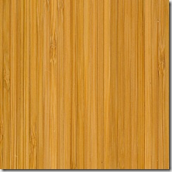
Here’s another option. It’s a Vertical bamboo which means the “strips” are turned on their sides.
I love the thin linear look of this one. This piece is “carbonized” in color which means the bamboo has been steamed and pressed and the sugars darken the color a bit. Carbonizing softens the product a little but a lot of people are looking for a darker color than the original light bamboo.
When looking for a bamboo- look for a piece that has bamboo from top to bottom- not just a thin layer of bamboo mounted on plywood or other substrate. I think bamboo having the bamboo all the way through is better- but that’s just my opinion.
And here’s another option for bamboo.
It’s called strand bamboo. This is when they take all pieces of the bamboo and smash them together with a lot of heat and pressure. This is the hardest bamboo they make. In fact, it’s harder than Oak… by quite a bit. It’s also priced a bit higher than the other two options and looks the least like traditional bamboo. Here’s another strand bamboo.
They took natural and carbonized pieces and sandwiched them together. I’m in love with this one. In fact, we were very close to installing in in our living area but it was about $2 more a sq. ft. than the one we selected and we just couldn’t.
Still not sold on a bamboo? How about one that looks like this:
Stained and scraped and you can hardly tell it’s bamboo.
Bamboo comes in so many different options and styles. If you are interested in bamboo for your home, do your research and don’t let your flooring supplier talk you out of it. In our recent search for a bamboo floor- if they didn’t sell bamboo or had some more expensive products- they worked very hard to try and convince me to go a different direction.
Well, it didn’t work because as I type- someone is installing this
in my living room.
Pictures to come!
PV2HU558TQEJ
Thursday, April 15, 2010
New Letters!
I’ve been busy but I’ve squeezed in some time to make letters. The “S” I made for a friend who gave it as a hostess gift. We didn’t know a whole lot about the house that she was putting it in so we kept it mostly neutral with a little pop of red. I think this is one of my favorites… but I say that everytime.
The KW I made for a Keller Williams office. It is the first time I got to use teal glitter… and that was wonderful.
If you like these, feel free to check out more HERE.
The Kitchen- What will one day be.
Last week I showed you the state of our kitchen after a few upgrades. Today, I will show you the upgrades we can’t afford. One day I will show you what my dream kitchen would be but will never happen in this house. No, what I’m showing you today is affordable… just not by us right now.
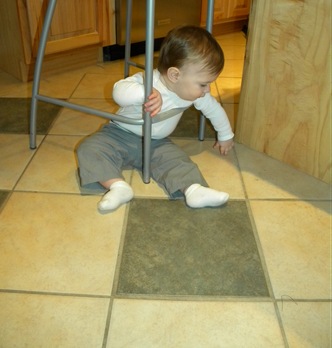
The floor. Yuck. I dislike ceramic tile. Well, I can’t say always because there are some good ones out there. Our backsplash is ceramic tile. For the floors- go with porcelain. Just trust me.
Naturally, ripping it up and starting over would be my preference. Someone did a bad job grouting and it’s coming up in a lot of areas, the colors are ugly and seem to always look dirty, and the green accent tile just isn’t my kitchen color.
I’ve been doing some reading and I think that we can remove just the green tile and replace it with something a little more “now”. Then, we can scrape up all the loose grout and grout over everything with a new gout (I would select one that is the same color as the light tiles so the floor would hopefully look much smoother).
Here is the tile that I would like to replace them with. It’s called Fabrique from Daltile and it’s beautiful in person. It’s hard to tell on the screen but when it’s in the kitchen it’s the perfect compliment to the other colors that are going on in there.
It’s probably much harder than it sounds but I’m guessing the cost to have someone come do it for us would be much, much more.
That’s project #1. Project #2 involves the nook I talked about HERE. Yes, I know I just changed it to this:
But I’ve had something else designed for a long time now… just waiting on money to magically appear in our account. Here’s the design.
Pretty basic. Upper and lower cabinets from Ikea. The lower ones look like this
And the upper ones look like this
And I have this cute desk picked out shown right and I can’t find it on their web site. It better not be discontinued! I have had this drawn for like 3 years so it’s possible that it will be gone by the time we are ready to do this. The countertop would probably be butcher block and the backsplash would be mirror tile.
This would accomplish a few things: give me a serving buffet area for parties (though I don’t have a lot now, I would love to have more in the future) and allow me to move my pantry from the open shelving in the laundry room to the kitchen- behind these nice cabinets. Then, in the pantry- I would create little “lockers” and turn it into a true mudroom.
I know I’m just dreaming here but it gives me something to look forward to. There are other things- like replace the countertops and actually get a range and microwave that has the same finishes as the other appliances… but this comes first… unless something else does.
Sunday, April 4, 2010
Quick, Easy, Affordable Kitchen Updates
Of course I didn’t take a lot of before pictures. This was on our tour before we purchased the house so it’s not good but it shows basically what it looked like.
For starters, we added cabinet hardware. I created a template with a piece of paper and they were easy to install. It makes cabinets so much easier to open and adds a uniqueness to pre-fab cabinetry.
We also added a backsplash. I’ll have to tell you more about that in another post but if we can do it, you can do it. Seriously, you can do it. I was like two months pregnant when we did this so I can’t even say if I was much help. Mosaic tiles are mounted on a mesh back and are 12”x12” so they go up pretty easily. As a special bonus- the tile was free (a perk of the job) so this project didn’t cost much.
After the backsplash- we painted the entire kitchen blue.
Unfortunately the accent tiles on the floor are green. My kitchen stuff isn’t green. I chose to ignore the green knowing that one day we will change the floor.
Here’s a better picture of the tile. It’s a ceramic mosaic from American Tile in blues and greens. I love using mosaics as a backsplash material- huge impact less work (sometimes). The spice racks we got from Ikea. We hung them from the bottom of the cabinets so we didn’t have to drill through the backsplash.
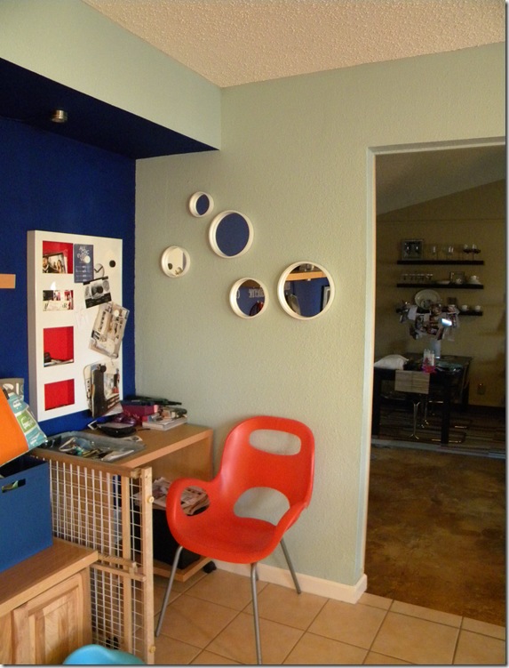
So here’s an interesting area of the kitchen. I have no idea what the previous owners used this for, I wish I could go back and ask them. Is it a bench? The layout of the kitchen doesn’t allow for this to be a banquette for a table so it’s really out of place. Another thing we replaced was the baseboards. You can see the old ones in this picture. They were stapled on the wall and were barely hanging on. A friend of ours came in and put
So here’s my creative solution for this area. I talk all about it HERE- it’s gone through a couple of iterations but I like where it is now. Tomorrow I’ll tell you what I want it to be some day.
There’s some detail on the EAT letters HERE. The curtain on the left conceals the laundry room. That fabric wasn’t my first choice- I was going for a stripe but this one worked. It was fast and easy to put of the curtain. I didn’t even sew the fabric- just ironed down the edges with that iron on tape stuff.
We have begun to replace our appliances with stainless but have only gotten to the fridge and dishwasher. I know it’s not great to mix your appliance finishes but you gotta do what you gotta do.
Kitchen rugs are hard. You need something that can withstand food getting spilled on it and chairs getting moved over it and then be able to clean it up. Here’s my solution. Carpet tile. They are becoming more popular and I think you will see them even more soon. It’s a rubber backed carpet that 2’x2’ and you can pull it up off the floor and take it to the sink and clean it off if you need to. I got these for free (another perk of the job) so that makes it even better.
The light over the table is another one from Ikea. Love the modern design of the fixture- I think it looks more expensive than it was.
These mirrors are my latest addition from CB2. The white frame is a painted metal and it’s really heavy- which I like.
And finally, we replaced a fan in the kitchen with some track lighting. I got the lights at Ikea (do you see a trend here?). The fan was located off-center over the island so we couldn’t to a pendant fixture right over the island without moving the hole. I decided that doing a track like this would be nice because we could wind it over the island and it wouldn’t matter where the hole for power was.
The “window treatment” (if you can call it that) is a table runner I got on clearance from Pier One applied above the window with thumb tacks. It may not stay there forever but it serves it’s purpose now!
Thanks for stopping by for my (work in progress) kitchen tour. I am planning to post all about kitchens this week so check back and see what else there is.
I’m linking up with:
Metamorphosis Monday @ Between Naps on the Porch
DIY Day at A Soft Place to Land
Stop by and be inspired by other creative ideas!