Of course I didn’t take a lot of before pictures. This was on our tour before we purchased the house so it’s not good but it shows basically what it looked like.

For starters, we added cabinet hardware. I created a template with a piece of paper and they were easy to install. It makes cabinets so much easier to open and adds a uniqueness to pre-fab cabinetry.
We also added a backsplash. I’ll have to tell you more about that in another post but if we can do it, you can do it. Seriously, you can do it. I was like two months pregnant when we did this so I can’t even say if I was much help. Mosaic tiles are mounted on a mesh back and are 12”x12” so they go up pretty easily. As a special bonus- the tile was free (a perk of the job) so this project didn’t cost much.
After the backsplash- we painted the entire kitchen blue.
Unfortunately the accent tiles on the floor are green. My kitchen stuff isn’t green. I chose to ignore the green knowing that one day we will change the floor.

Here’s a better picture of the tile. It’s a ceramic mosaic from American Tile in blues and greens. I love using mosaics as a backsplash material- huge impact less work (sometimes). The spice racks we got from Ikea. We hung them from the bottom of the cabinets so we didn’t have to drill through the backsplash.

So here’s an interesting area of the kitchen. I have no idea what the previous owners used this for, I wish I could go back and ask them. Is it a bench? The layout of the kitchen doesn’t allow for this to be a banquette for a table so it’s really out of place. Another thing we replaced was the baseboards. You can see the old ones in this picture. They were stapled on the wall and were barely hanging on. A friend of ours came in and put
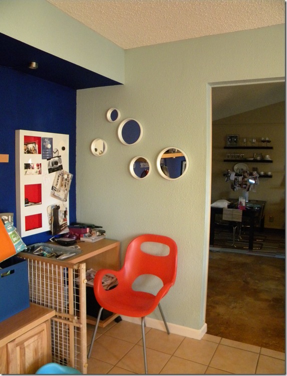
So here’s my creative solution for this area. I talk all about it HERE- it’s gone through a couple of iterations but I like where it is now. Tomorrow I’ll tell you what I want it to be some day.

There’s some detail on the EAT letters HERE. The curtain on the left conceals the laundry room. That fabric wasn’t my first choice- I was going for a stripe but this one worked. It was fast and easy to put of the curtain. I didn’t even sew the fabric- just ironed down the edges with that iron on tape stuff.

We have begun to replace our appliances with stainless but have only gotten to the fridge and dishwasher. I know it’s not great to mix your appliance finishes but you gotta do what you gotta do.

Kitchen rugs are hard. You need something that can withstand food getting spilled on it and chairs getting moved over it and then be able to clean it up. Here’s my solution. Carpet tile. They are becoming more popular and I think you will see them even more soon. It’s a rubber backed carpet that 2’x2’ and you can pull it up off the floor and take it to the sink and clean it off if you need to. I got these for free (another perk of the job) so that makes it even better.
The light over the table is another one from Ikea. Love the modern design of the fixture- I think it looks more expensive than it was.

These mirrors are my latest addition from CB2. The white frame is a painted metal and it’s really heavy- which I like.
 And finally, we replaced a fan in the kitchen with some track lighting. I got the lights at Ikea (do you see a trend here?). The fan was located off-center over the island so we couldn’t to a pendant fixture right over the island without moving the hole. I decided that doing a track like this would be nice because we could wind it over the island and it wouldn’t matter where the hole for power was.
The “window treatment” (if you can call it that) is a table runner I got on clearance from Pier One applied above the window with thumb tacks. It may not stay there forever but it serves it’s purpose now!
Thanks for stopping by for my (work in progress) kitchen tour. I am planning to post all about kitchens this week so check back and see what else there is.
I’m linking up with:
Metamorphosis Monday @ Between Naps on the Porch
DIY Day at A Soft Place to Land
Stop by and be inspired by other creative ideas!


4 comments:
Luv your backsplash tile and light fixture...awesome makeover!
Blessings,
Linda
You've done a terrific job in your kitchen. Your eye for using paint is great to me -- creating that nook out of the blank space is really brilliant. Hope you'll come by Atticmag for our really useful giveaway. -- Jane F.
I love the tile. Great job!
The change was truly terrific! Looks homey, yet reminiscent of those you see in design magazines or cook shows. The carpet tiles remind me of the ones we had in our office pantry as well as the dining chairs.
Post a Comment